Tube and Packaging Concepts

We were asked to reposition this toothpaste as a premium tooth whitening

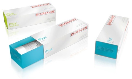
brand. The brand objectives were to market this toothpaste as a luxury beauty product. While most of the competitor boxes use foils and complex graphics, this design lets the clean minimal white of the paper and the bright fluorescent inks printed on the inside highlight the tube.
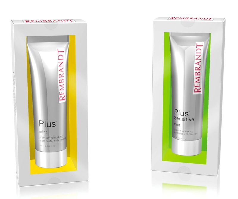
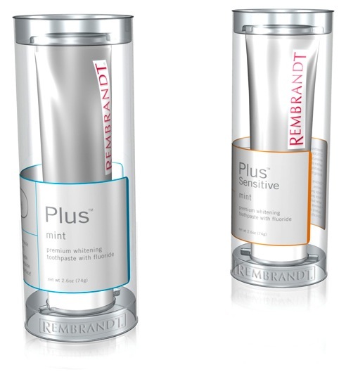
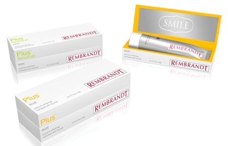
Each additional concept presented to the client highlights one of the brand attributes. The top left box is designed to feel premium and upscale; a box with sleeve uses contrasting matte and high-gloss papers, with embossed details to create a tactile experience. The lower left box with a

mirrored metallic foil, reflects your smile. The clear tube on the right with an applied label highlights the science behind the whitening, and is designed to look like it came straight out of a laboratory.